Configure and optimize map display across different devices and screen sizes
How to Configure Map Responsiveness
Map Responsiveness allows you to optimize how your center map displays across different devices and screen sizes. This ensures that visitors have the best possible experience whether they're using desktop computers, tablets, mobile devices, or the display app on kiosks.
The responsiveness system automatically adjusts map scaling, positioning, and element sizes based on the device type, ensuring optimal visibility and usability across all platforms.
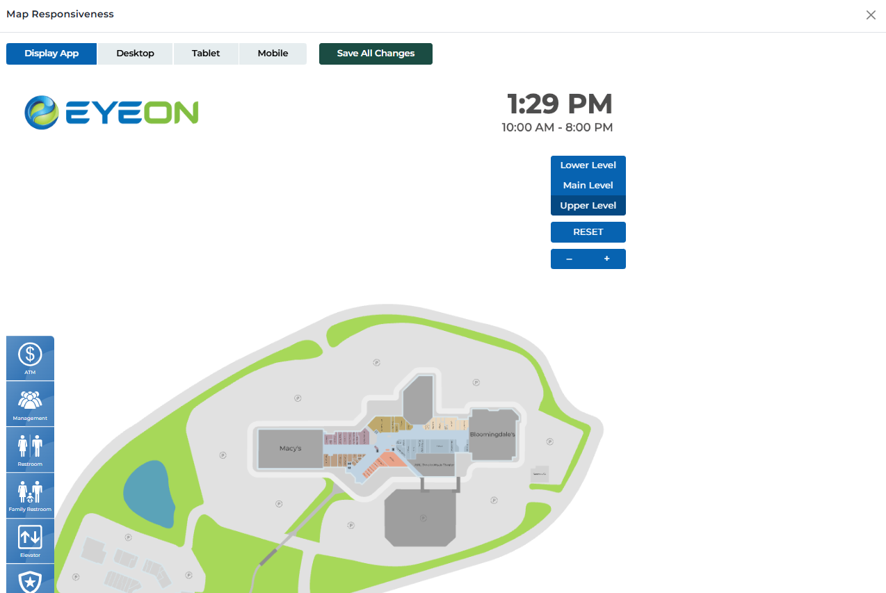
Map responsiveness interface
Supported Device Types
Configure map display for different device categories:
Touch kiosk displays running the EyeOn Kiosk Application
Device Characteristics:
- • Large touch screen displays
- • Portrait or landscape orientation
- • High resolution and pixel density
- • Touch interaction capabilities
- • Optimized for visitor engagement
- • Full-screen application experience
Optimization Focus:
Optimized for maximum visibility and touch interaction
Optimized for maximum visibility and touch interaction
Standard desktop and laptop computers
Device Characteristics:
- • Large screen sizes (13" and above)
- • Mouse and keyboard interaction
- • High resolution displays
- • Full browser window experience
- • Multiple window support
- • Precise cursor control
Optimization Focus:
Optimized for detailed viewing and precise interaction
Optimized for detailed viewing and precise interaction
Tablet devices and medium-sized screens
Device Characteristics:
- • Medium screen sizes (7" to 12")
- • Touch interaction capabilities
- • Portrait or landscape orientation
- • Mobile-optimized browsers
- • Gesture-based navigation
- • Responsive design elements
Optimization Focus:
Balanced between desktop and mobile experiences
Balanced between desktop and mobile experiences
Smartphone and small mobile devices
Device Characteristics:
- • Small screen sizes (under 7")
- • Touch interaction with fingers
- • Portrait orientation preferred
- • Limited screen real estate
- • Gesture-based navigation
- • Simplified interface elements
Optimization Focus:
Simplified interface with essential features only
Simplified interface with essential features only
Responsiveness Features
Key features for optimizing map display across devices:
Preview map appearance on different device types
- • Switch between device views instantly
- • See how map elements scale and position
- • Test touch interactions and gestures
- • Verify text readability and button sizes
- • Check overall layout and spacing
- • Identify potential display issues
Automatic adjustment of map elements based on device
- • Polygon sizes scale appropriately
- • Text remains readable at all sizes
- • Buttons and controls resize for touch
- • Icons maintain proper proportions
- • Spacing adjusts for screen size
- • Zoom levels optimize for device type
Optimized touch interactions for mobile devices
- • Larger touch targets for fingers
- • Gesture-based zoom and pan
- • Swipe navigation support
- • Touch-friendly button sizes
- • Reduced accidental touches
- • Improved touch responsiveness
Support for both portrait and landscape orientations
- • Automatic orientation detection
- • Layout adjustment for orientation changes
- • Optimized content for each orientation
- • Smooth transitions between orientations
- • Consistent functionality across orientations
- • Proper scaling for different aspect ratios
Optimized performance for different device capabilities
- • Reduced complexity for mobile devices
- • Optimized image sizes and quality
- • Efficient rendering for touch devices
- • Battery life considerations
- • Network usage optimization
- • Smooth animations and transitions
Save responsiveness settings and reset to defaults
- • Save current responsiveness settings
- • Reset to default configurations
- • Apply settings across all devices
- • Revert to previous settings if needed
- • Test settings before saving
- • Coordinate changes with team members
Configuration Steps
Step-by-step process for configuring map responsiveness:
Select Device Type
Choose the device type you want to configure
- • Click on the device type button (Display App, Desktop, Tablet, Mobile)
- • The map will switch to that device's view
- • You can switch between device types to compare
- • Each device type has its own configuration settings
Preview Map Display
Review how the map appears on the selected device
- • Check polygon sizes and positioning
- • Verify text readability and button sizes
- • Test touch interactions if applicable
- • Review overall layout and spacing
- • Identify any display issues or problems
Adjust Settings
Make necessary adjustments for optimal display
- • Modify polygon sizes if needed
- • Adjust text sizes for readability
- • Reposition elements for better layout
- • Test different zoom levels
- • Ensure touch targets are appropriate size
Test Interactions
Test all interactive elements on the device
- • Test zoom and pan functionality
- • Verify touch gestures work properly
- • Check button and control responsiveness
- • Test polygon selection and editing
- • Ensure smooth navigation experience
Save Changes
Save your responsiveness configuration
- • Click 'Save All Changes' to apply settings
- • Settings will be applied to all users of that device type
- • Changes take effect immediately
- • You can always modify settings later
- • Test the saved configuration to ensure it works properly
User Permissions & Responsiveness Access
All user types have full access to map responsiveness configuration with appropriate center restrictions.
Responsiveness Management Capabilities:
Can adjust responsiveness settings for their assigned center
Can preview map on different device types
Can save responsiveness configuration changes
Can reset responsiveness settings to defaults
Best Practices
Device-Specific Optimization
- • Test map display on actual devices when possible
- • Consider the primary use case for each device type
- • Optimize touch targets for finger interaction on mobile
- • Ensure text remains readable at all screen sizes
- • Test both portrait and landscape orientations
- • Verify performance on lower-end devices
User Experience Considerations
- • Maintain consistent functionality across all devices
- • Provide clear visual feedback for touch interactions
- • Use appropriate gesture controls for each device type
- • Ensure important information is always visible
- • Test with users of different technical skill levels
- • Gather feedback from actual device users
Performance Optimization
- • Optimize images and graphics for different screen densities
- • Use appropriate file sizes for mobile data connections
- • Minimize complex animations on mobile devices
- • Test loading times on slower connections
- • Consider battery life impact on mobile devices
- • Monitor performance metrics across device types
Testing & Validation
- • Test on multiple devices of the same type
- • Verify functionality across different browsers
- • Test with different screen sizes and resolutions
- • Validate touch interactions on actual touch devices
- • Test in different lighting conditions
- • Regularly review and update responsiveness settings
Ready to Optimize Your Map Responsiveness?
Access the Portal CMS to configure and optimize your center map for all device types.
Access Portal CMS